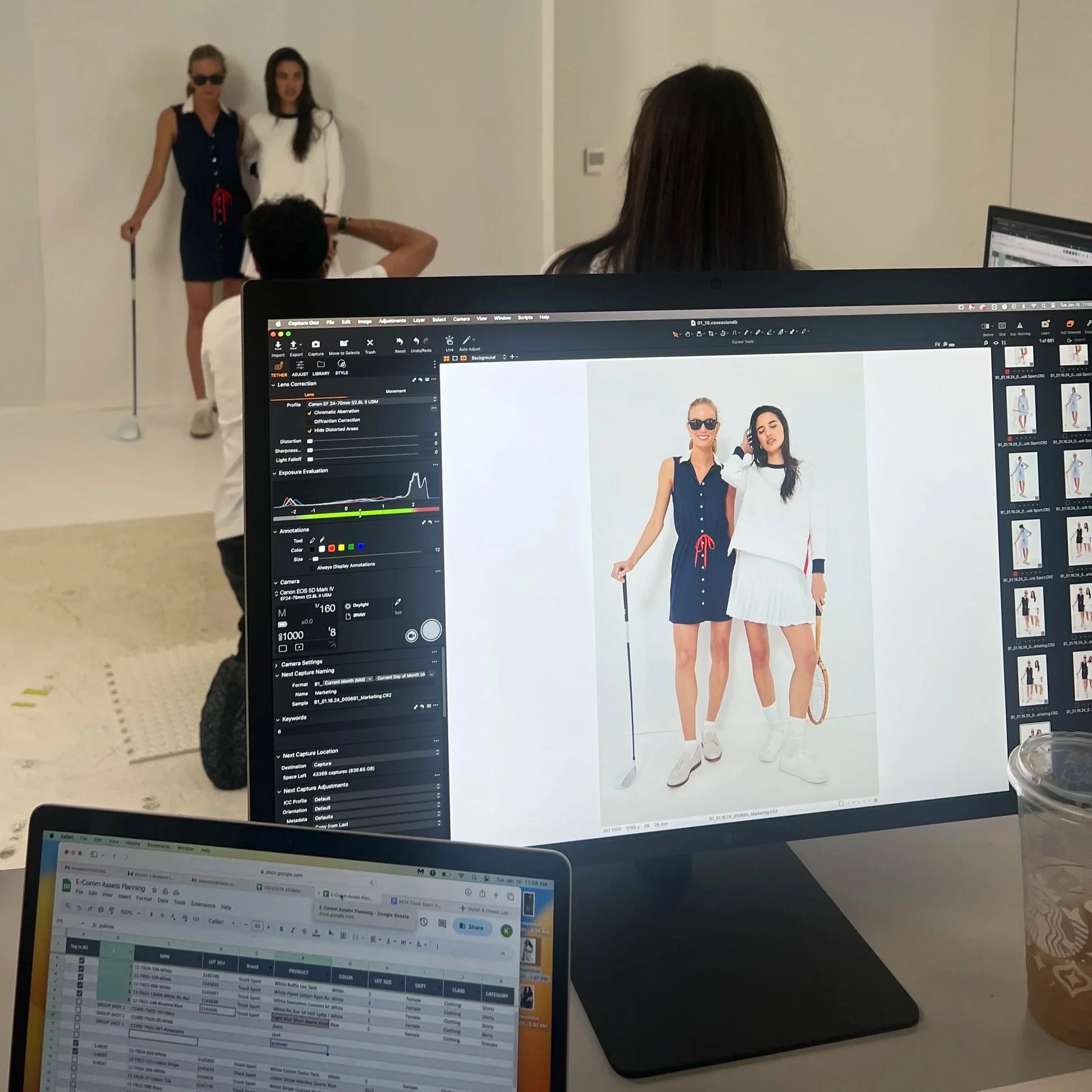
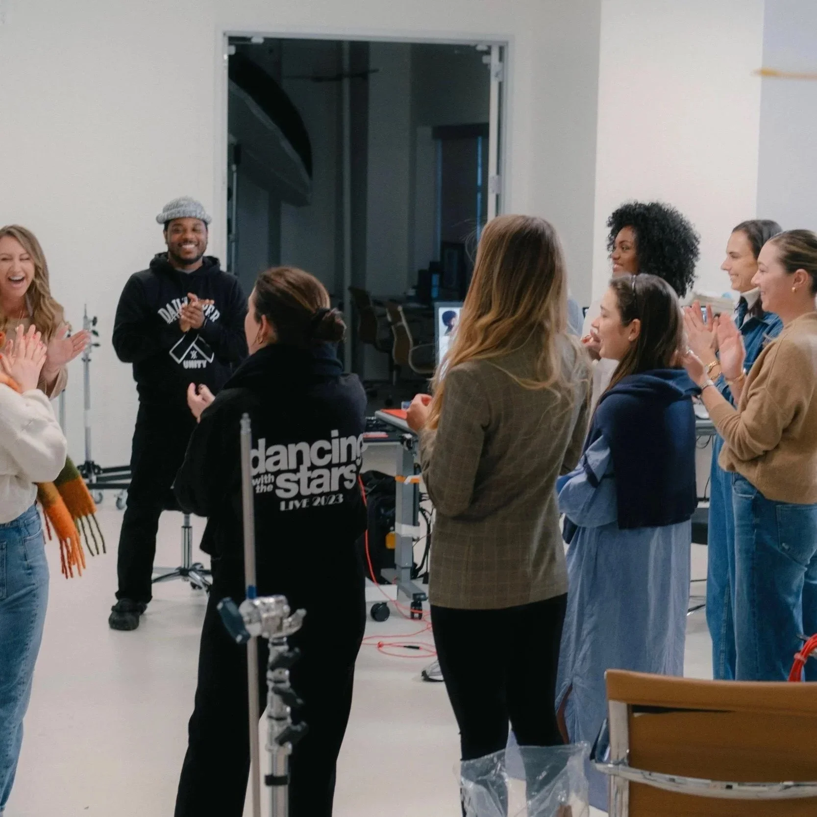
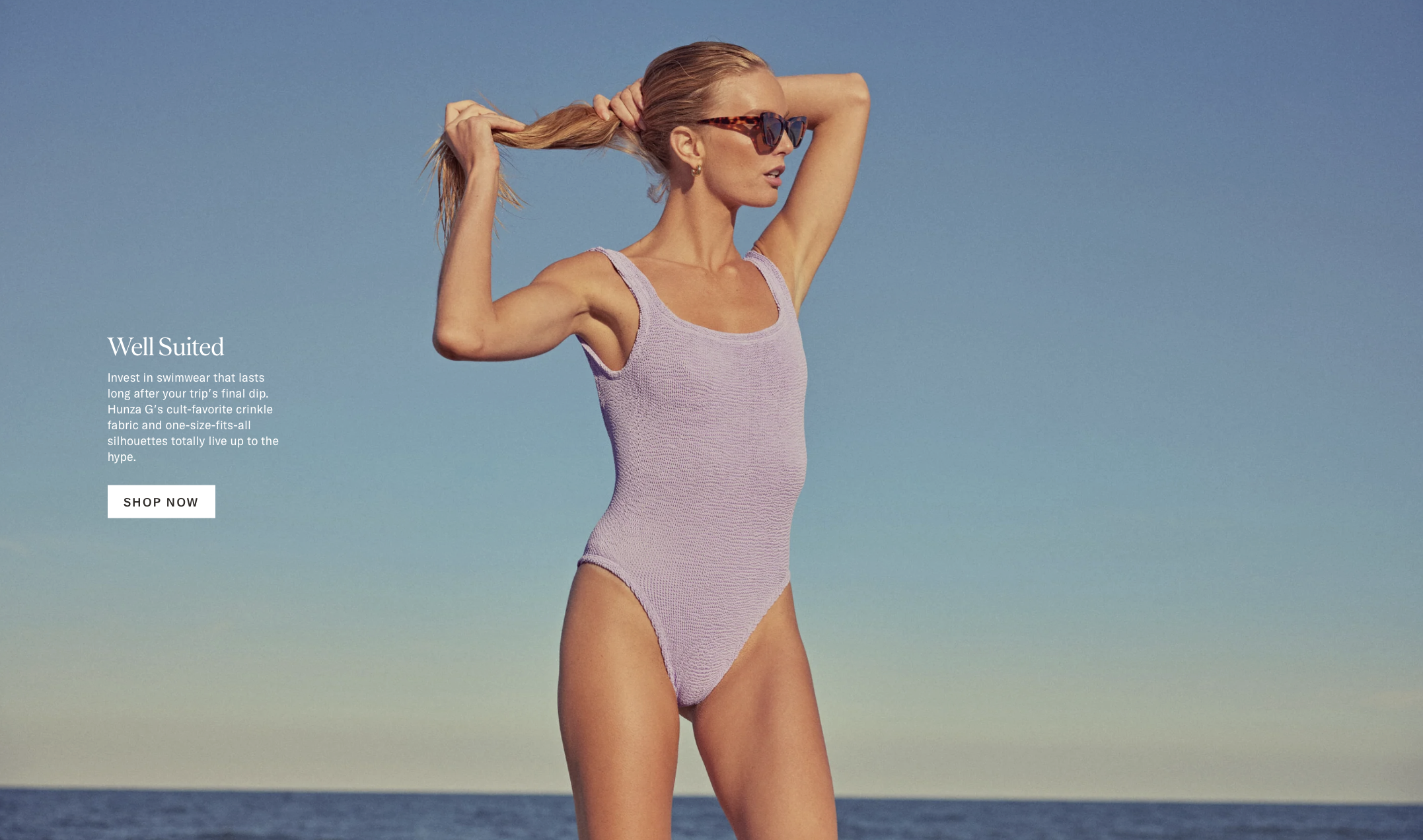
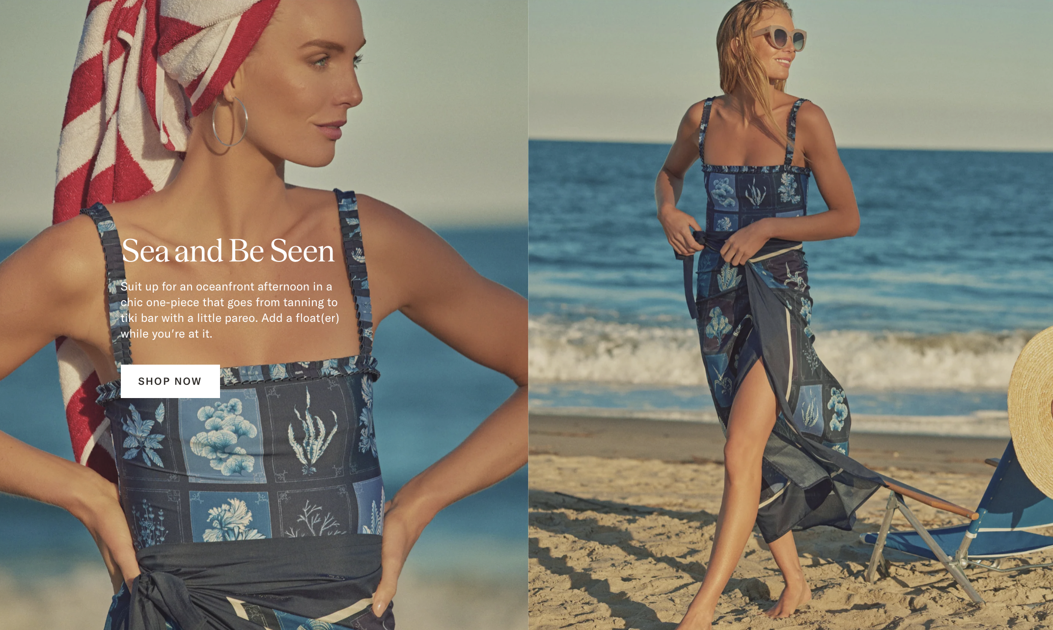
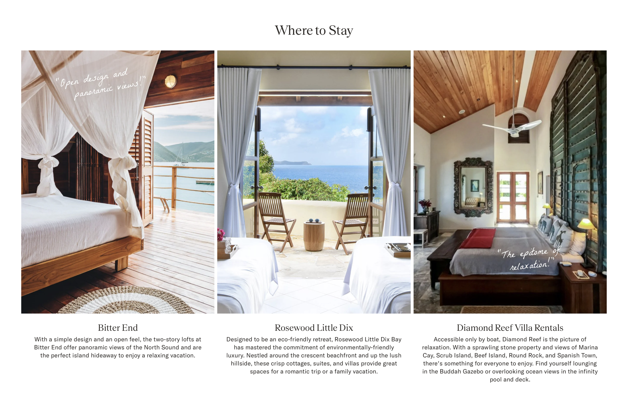
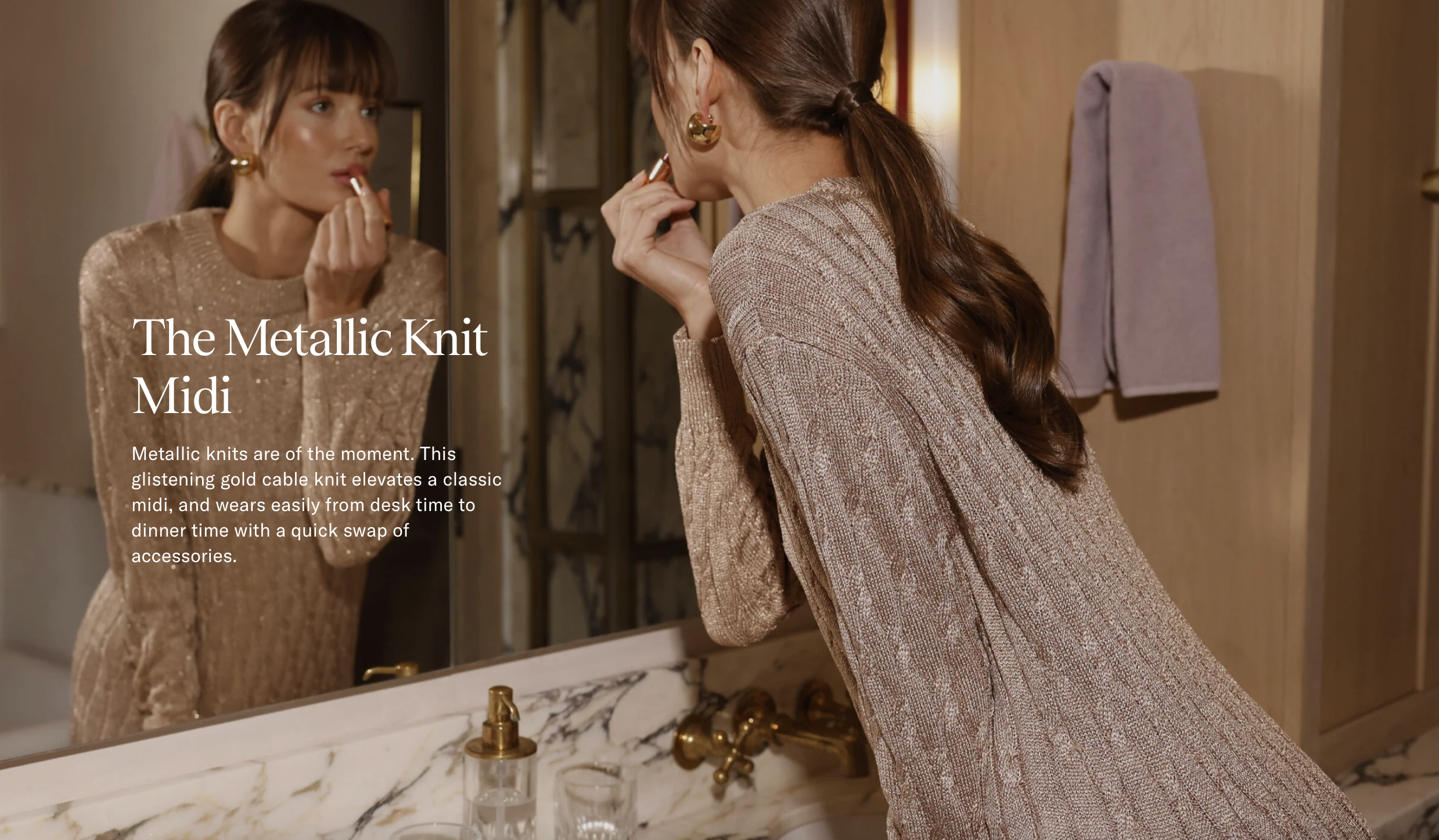
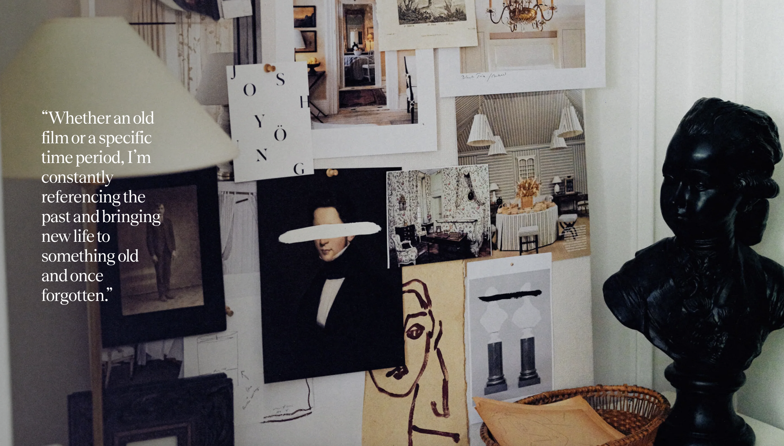
Tuckernuck Digital Production
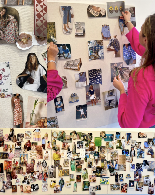
I collaborated closely with the Art Director to develop the mood board for Tuckernuck’s spring seasonal campaign, helping define the visual tone and aesthetic from the very start. On set, I assisted with wardrobe styling to curating images in Capture One. Amongst the production team, I fostered a collaborative, high-energy environment that encouraged creativity across the group. After the shoot, I partnered with the graphic design team to turn the campaign imagery into editorial blog posts for the website, bringing the brand’s signature style to life across travel, fashion, and lifestyle storytelling. Through this experience, I gained an understanding of the creative process, from initial concept through to final publication.


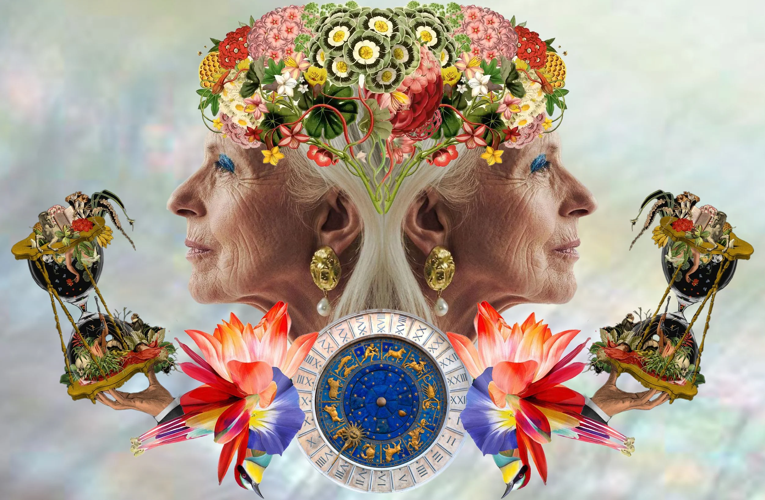
The Art of Aging
This piece celebrates the richness of aging, portraying it as a form of knowledge and beauty. I created this montage featuring an older woman radiating youthful vibrancy with colorful makeup, paired with the zodiac-adorned clock face of St. Mark’s Square in Venice, alongside a hand holding an hourglass, a symbol of wisdom and the passage of time. The work explores age as a source of depth, vitality, and elegance, showing that embracing time allows one to flourish. It highlights the wealth found in experience, the sophistication of accumulated knowledge, and the understated sensuality inherent in a life fully lived.
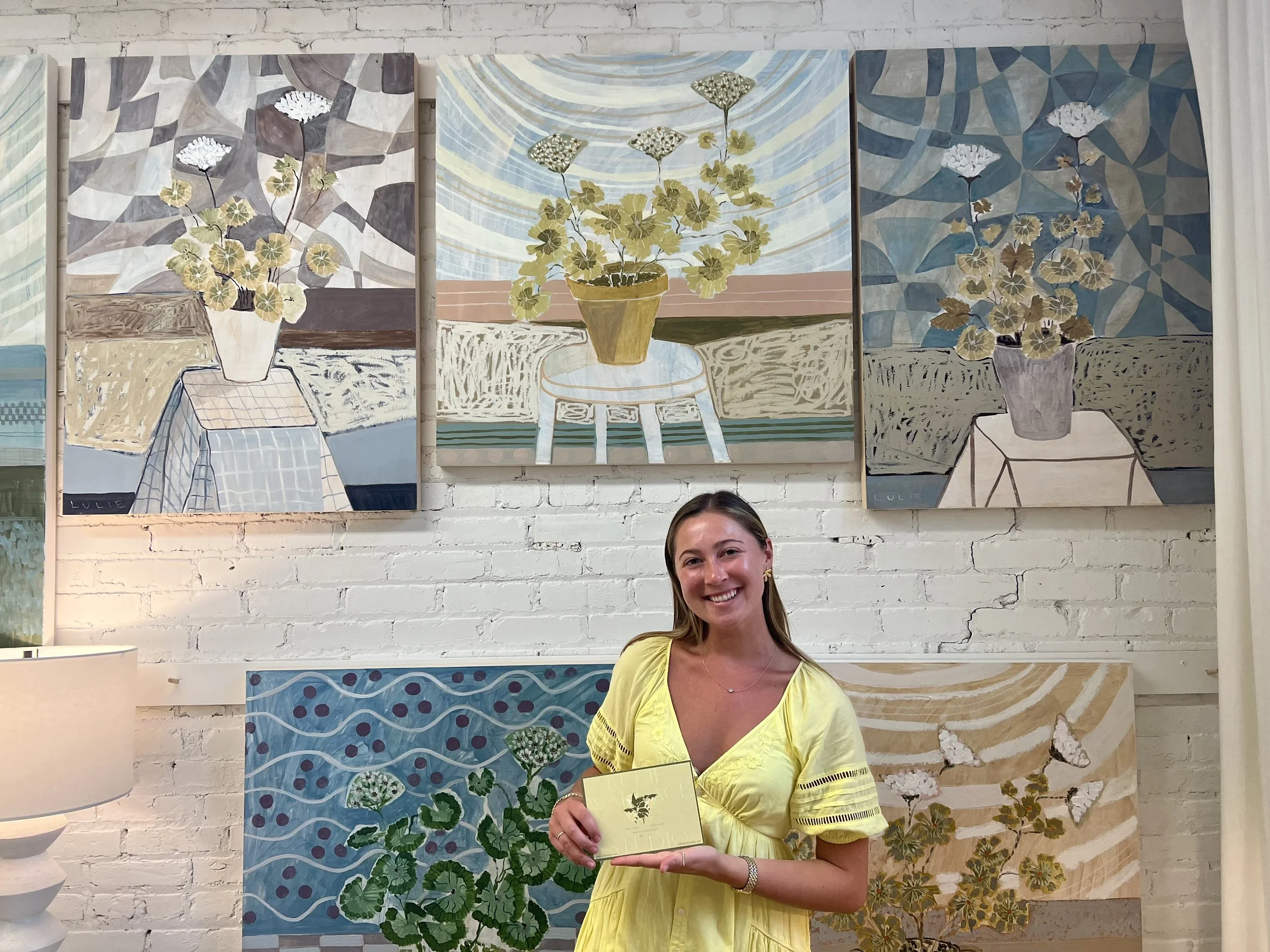
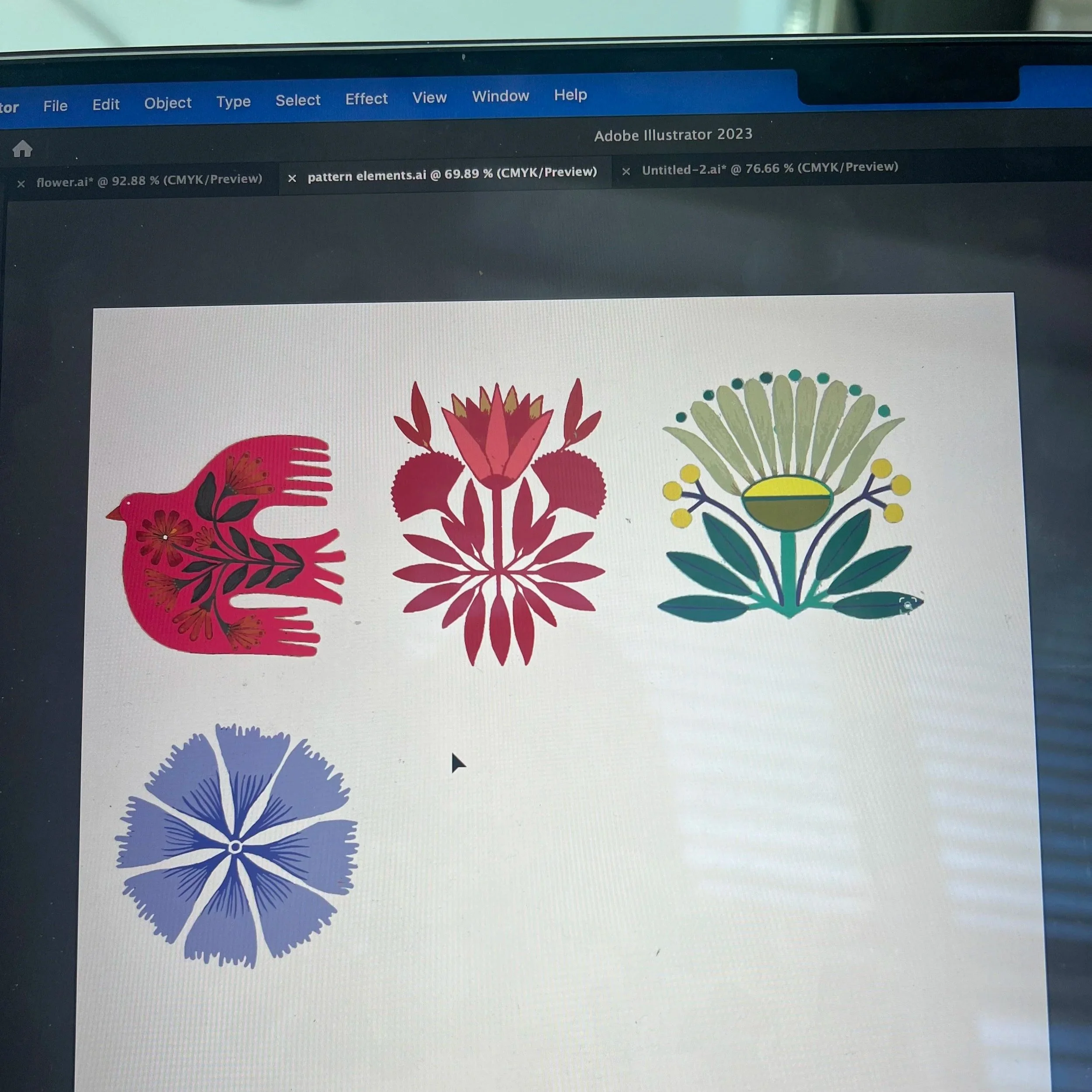
Textile & Package Design
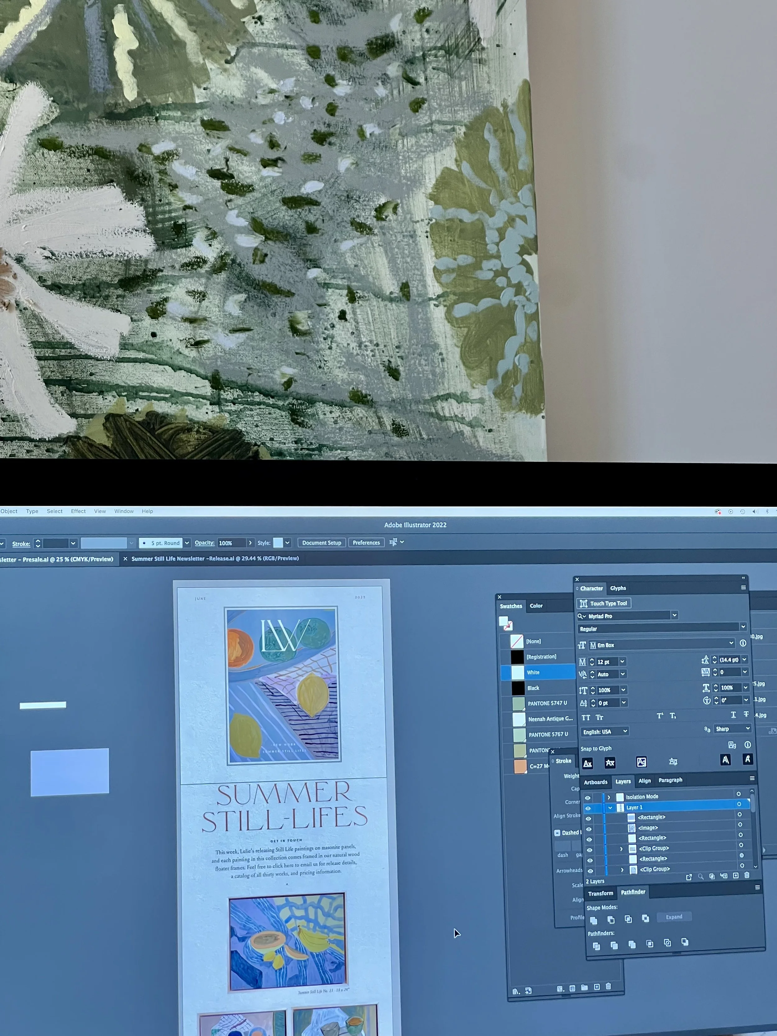
While working with artist Lulie Wallace and her design team, I helped develop seasonal packaging for art pieces and created handwritten company letters. I worked closely with the team to translate the brand’s aesthetic into physical designs and produced original pieces using Adobe Illustrator and Procreate, including textile patterns and layouts. This role gave me hands-on experience with design and branding, and helped me understand how to create work that is both visually appealing and carefully made.
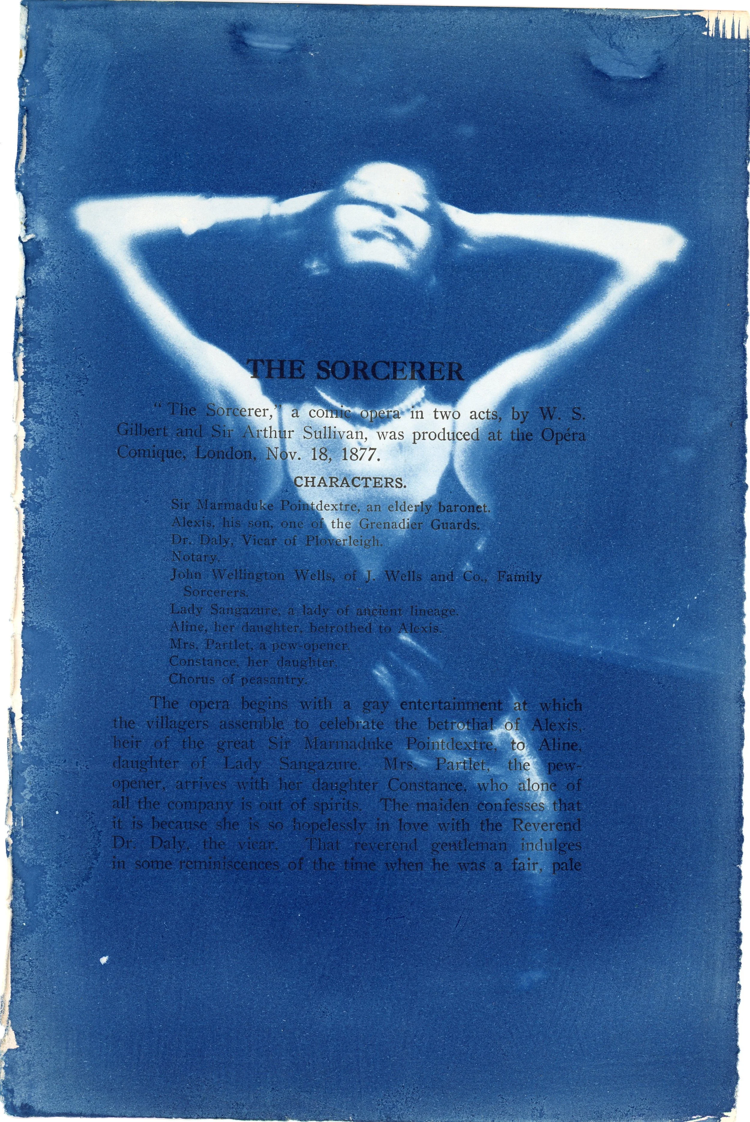
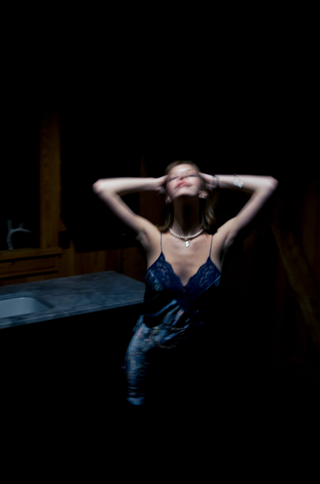
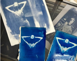
Impressions of Femininity
This piece grew out of my interest in femininity’s form and role. I photographed a woman to capture a sense of tension, then turned the image into a cyanotype print on a book page with a role description from The Sorcerer. By combining the female form with text through the hands-on, time-based cyanotype process, I explored the push and pull of vulnerability and strength, presence and performance. The soft blue tones give the body a sense of intimacy and symbolism, letting it speak alongside the text in a dialogue.

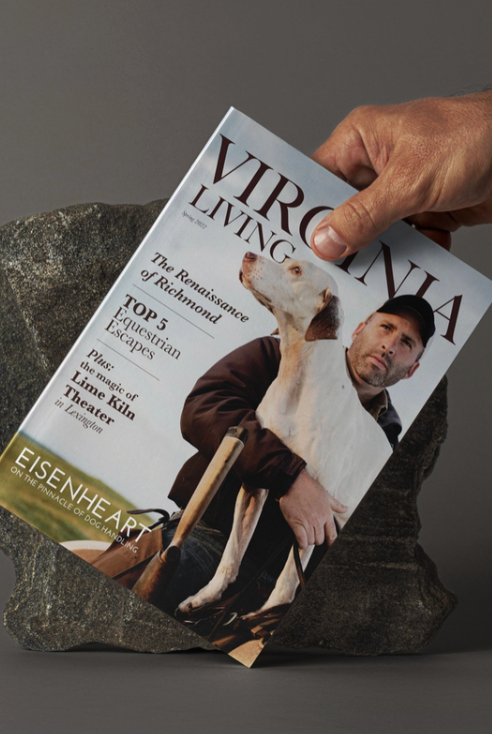
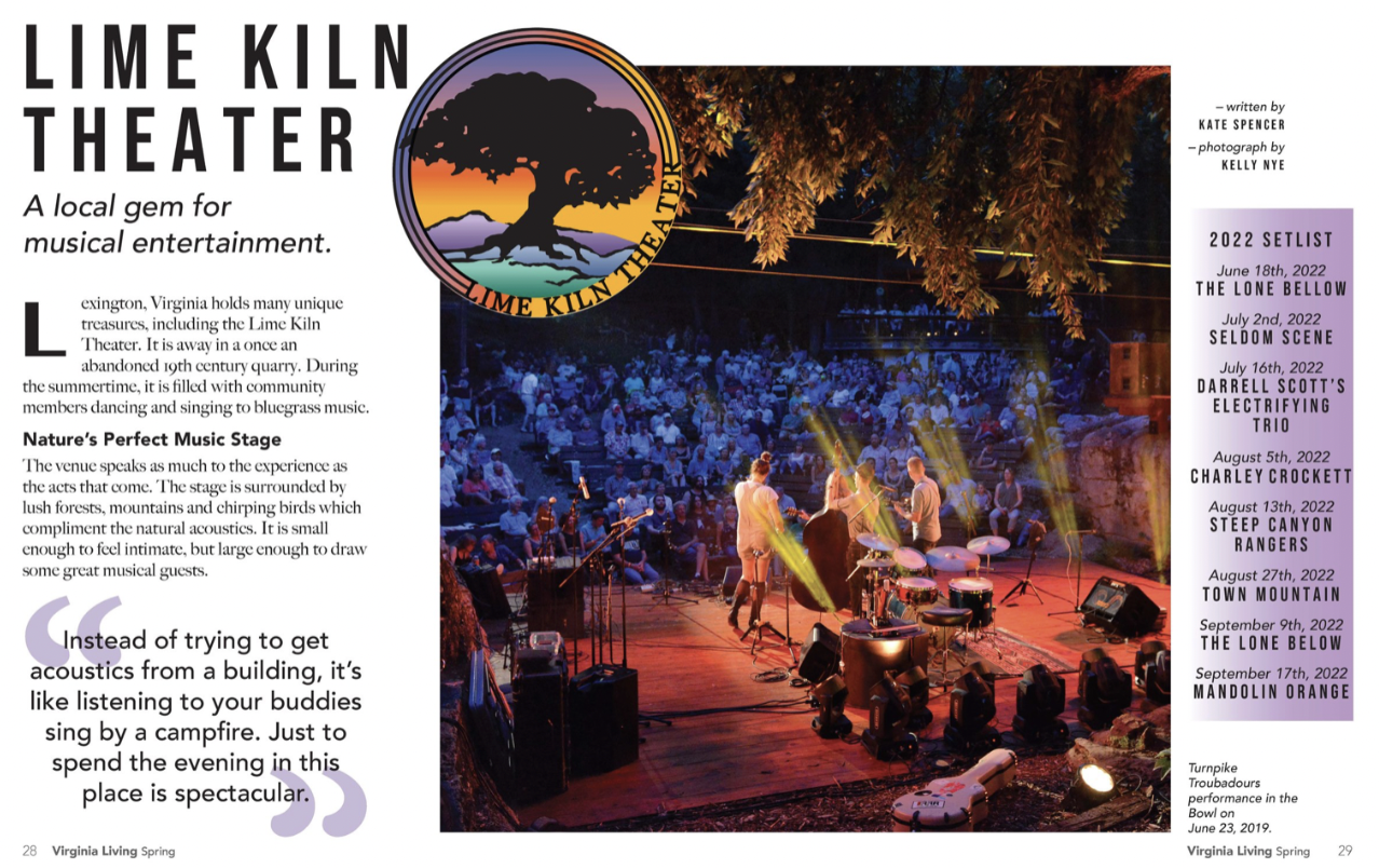
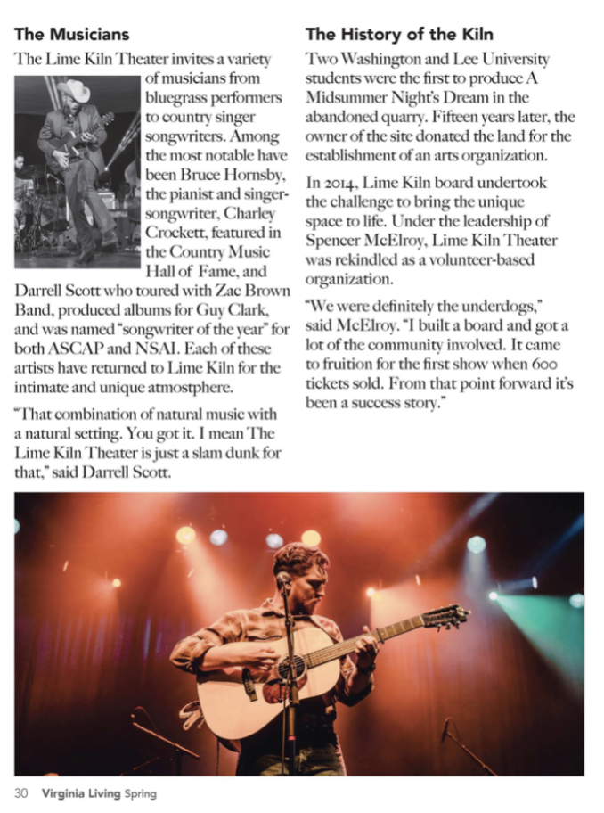
Lime Kiln Feature in Virginia Living Magazine
For The Virginia Living Magazine, I contributed a feature story on the Lime Kiln Theatre, a historic music venue in Lexington, Virginia. The project aimed to capture the venue’s charm and Virginia’s rich heritage through thoughtful storytelling and visual composition. My work highlighted the theatre’s distinctive architecture, scenic surroundings, and cultural significance, crafting a narrative that connects readers to the region’s history. This project allowed me to combine editorial photography, design sensibility, and narrative curation to bring the Lime Kiln’s story vividly to life.